
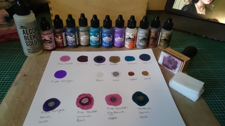
I had so much fun playing with my alcohol inks the other day that I couldn’t wait to have another chance to get messy with them again. I was asked about the colours I used to create this card so I sat and made a colour swatch of my ink. I must confess that on that card I realised I had used ink from another company as well as the Ranger/Tim Holtz alcohol ink but it doesn’t seem to be available now. Here are the colours I have and the other supplies I use:
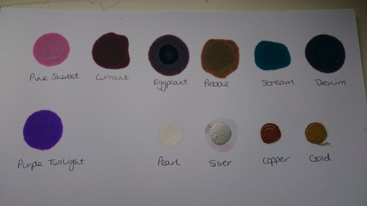
I have had to do the colour swatch on different card as I have run out of my glossy card stock. I tried a few different types of card and found that the colours varied vastly on each one. The photo shows the one that I feel shows the colours accurately. I also experimented colouring the background with Promarkers to get a flat base colour to build on and that worked well.
I then set to work. I have used a silver metallic film and painted regular card stock with white gesso and Ranger gloss multi medium as different bases to work on to make up for my lack of glossy card. Here are some of the results:
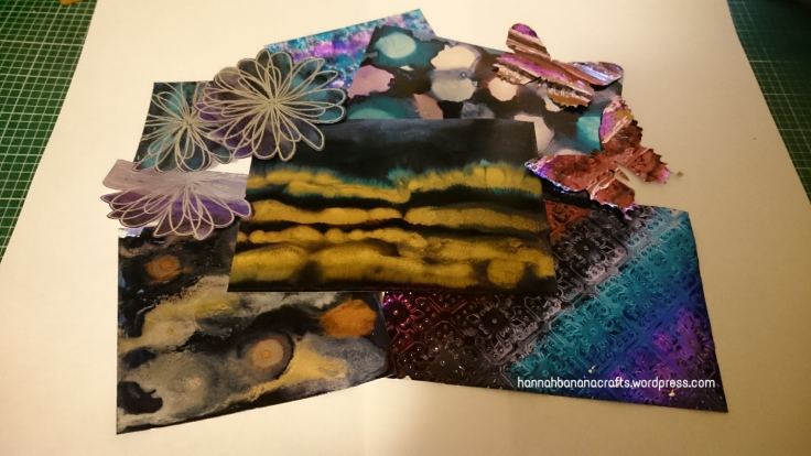
As you can see I have die cut some, stamped and embossed on others and ran another through my big shot with an embossing folder. Now I just have the task of making them into cards.
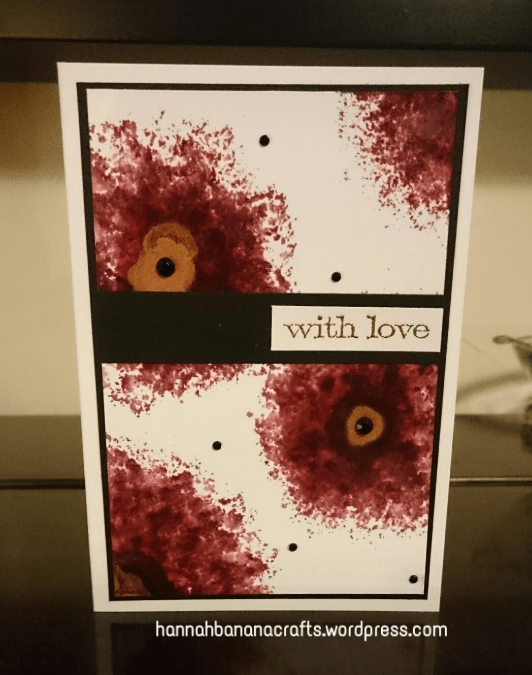
For yesterdays entry in to the 30 day colouring challenge over at The Daily Marker I made this card:
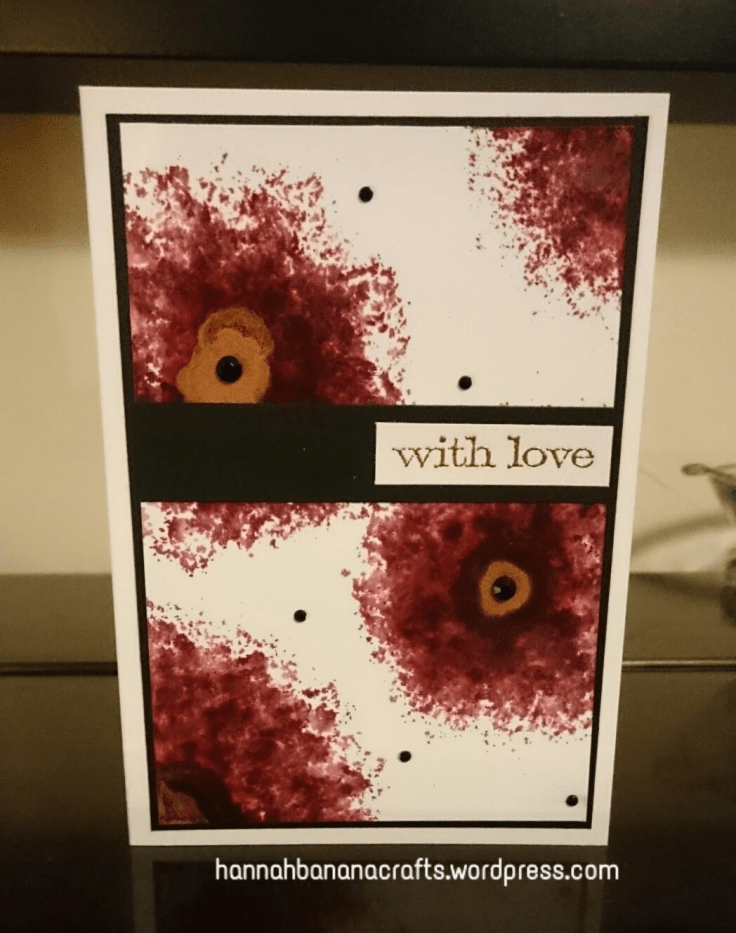
I used the Tim Holtz blending tool with the felt pads to dab ink on in circles making sure the ink was denser towards the middle. I used the inks Pink Sherbet and Currant with a drop of copper mixative in the centre. I finished off with a Tim Holtz sentiment embossed in copper embossing powder.
A bit of a marathon post today but I hoped to explain better some of the process.
Happy crafting – I’m off to scrub the alcohol ink from my hands yet again!
Hannah


I love this card!
When do you use the alcohol blend solution?
Your a great teacher 🙂
Ah, thank you. You can use the blending solution a number of ways – you can splash drops directly onto your work after applying alcohol ink to help blend or create interesting patterns in the inks (it creates circles where it ‘pushes’ the inks away), put some on the blending tool when you have added some ink colours on it as it will lighten them and blend them better on the card, I have wiped it across the card and dribbled it over before adding colour to get some different effects and is essential for cleaning up afterwards as the ink stains everything. Make sure you have a mat underneath your work that won’t be ruined by the inks.
I hope that helps 🙂
Alcohol inks are so much fun, I use photo paper, also white tiles are great. They are so easy to manipulate I had patients creating flowers on white tiles. The only problem was how to seal them after? I love your pink, I don’t have that colour.
Why didn’t I think of photo paper – I’m sure I have some round somewhere. I’ve not tried it on tiles before but can imagine the effects are cool. I have used them on polymer clay mixed with liquid clay and that is fun.
Would a spray sealant work? Like an artists spray fixative maybe. I keep meaning to try it with glossy accents to see how this would work on small pieces. Even a Fimo varnish – it’s water soluble but if the pieces where for decoration rather than use that should be ok. Hmmmmm (running off to buy white tiles……)
Spray varnish kinda worked, but left splatter marks as it reacted with the ink, I did like the effect, but in some cases it would wreck your work, also works on acetate, I did a peacock painting, just mounted with white paper behind….it was the only thing I could find large enough to fit in the frame that alcohol ink would stick to- I think the peacock is under my mixed media? I might have put the flower tiles on that page too…I need that pink!
Hmmmmm, maybe spray varnish not such a good idea then. Your peacock is amazing – you got such control with the inks and I’m totally in love with your hare paintings – they all have such character.
I probably use the pink sherbet ink the most as it is such a light pretty ink and seems to go well with most of my other colours. I bought some new inks the other day so can’t wait for them to arrive so I can have a play 🙂
It sure is a lovely pink, and would compliment the many darker shades. Did you get the tiles? Dabbing and painting with the inks is not as hard as it seems, it’s just for ages we were pushed into using them for backgrounds only, but they are so much more. Give it a go….a peacock is a good start, the inks compliment the bird well/ trees and flowers also are good. The main thing is they are so much fun to use
I haven’t got round to getting tiles but I intend too. I’m looking forward to trying them out 🙂