Published by The Artisan Duck
Hello and welcome to my blog.
My name is Hannah and I am a jewellery designer and maker living in Nottingham, England with my husband, two children and one very cheeky rescue cat.
I have tried many different crafts and styles of jewellery making but I have a particular love for working with polymer clay and bead weaving. I am now fortunate enough to write tutorials for Bead and Jewellery Magazine, I have written online tutorials for Beads Direct and my work has been featured in Mollie Makes magazine. Alongside my tutorial work I run an Etsy and Redbubble shop and sell my jewellery locally at fairs and in shops.
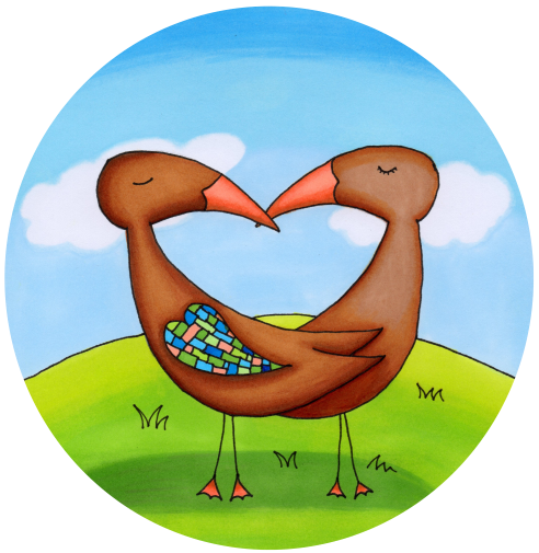
I am also an Illustrator with a tendency to lean towards whimsical and magical artwork.
I my spend most days dreaming of new projects fuelled by many cups of tea, chocolate and audio books.
Thank you for visiting my blog and I hope to see you again soon.
Hannah x
View all posts by The Artisan Duck


Love these.
Daddo
Thank you Dad 😃
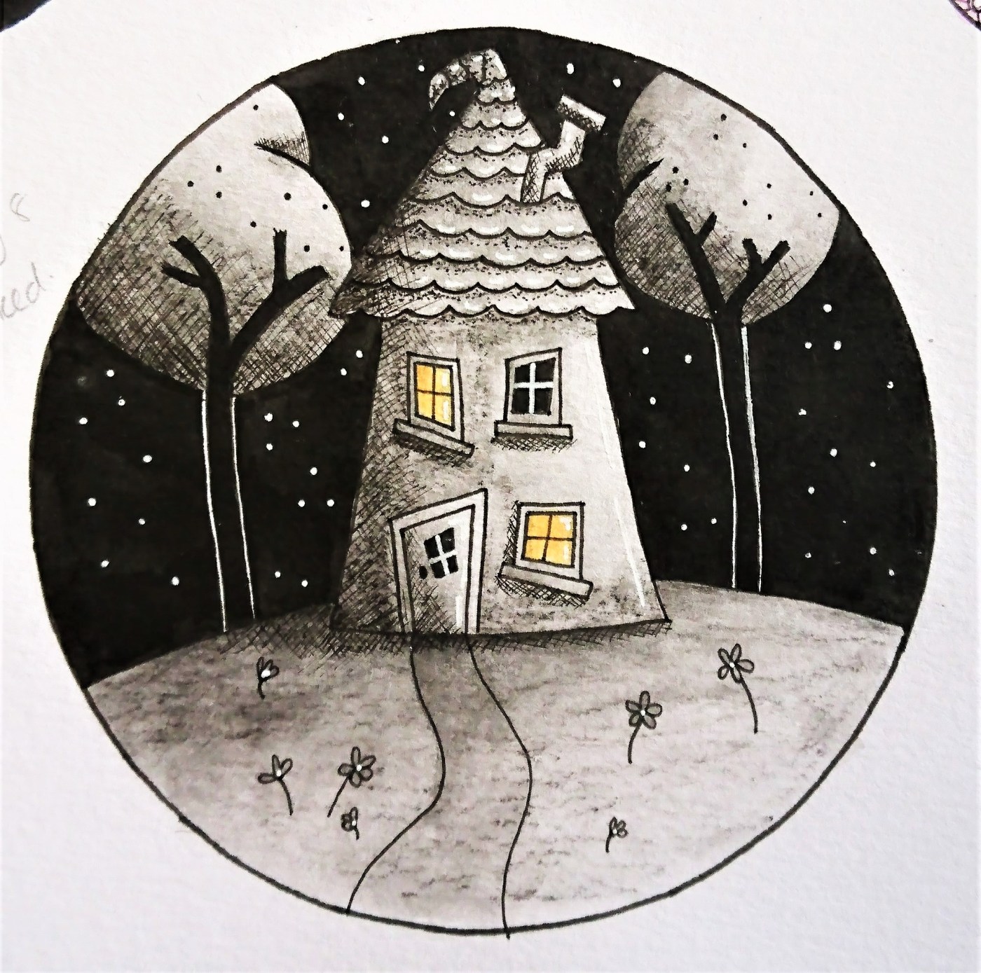
All great, but my absolute favourite is the little Crooked House. Love that one! C. xxx
Thank you Cobs. Easily my favourite too. Wondering if it would loose some charm if I did it in colour. So tempted to draw it again but bigger. Hxx
It reminds me of a painting I did donkeys years ago – of three little houses on a bendy hill. I didn’t realise that anyone but me liked it, so when it came time for moving, I sent it to the charity shop. Only for daughter No2 to ask me about it a week later, and wanting to be given to her!
Up till then she never said word about it. tsk tsk.
Twas too late. It was gone.
I think you could certainly do it bigger, and in colour. What have you got to lose? Go for it. I think it could become a big favourite.
I have this funny little feeling that you could also do it all in blue, like a delph plate – or red, as in ‘red work’. Even all in brown – chocolate colours.
It’s one of those paintings which is like a Warhol …. it could look really stunning done in many colours.!
You clever thing.
Squidges ~ Cobs. xxx
It would be cool to try it in different colours to see how different it looked.
How awful about your painting and typical that someone wants what you just donated. Hxx
Your drawings are so cute! I love the little house most though, adorable 🙂
Thank you Emma. I think the house is my favourite so far.
These are all great, but I actually oohed aloud at Crooked
Thank you so much. Crooked is definitely my favourite – I’m already planning to re-do it but bigger!
I really like the house with just the windows in colour, but i guess if you try it in colour you won’t lose anything and then you can see which you prefer. I love the colours in shy as well. Your drawings are gorgeous
Thank you so much 😊 I agree that just highlighting the windows in yellow against the grey /black really makes them pop.
I bet I’m not alone in this heartfelt feeling . . . I miss you and your posts every few days on your blog.
But … I know that life is busy.
Just wanted you to know, and to send love and squidges ~ Cobs. x
Thank you so much Cobs. I am missing my blog and everyone in blog land terribly. The craft fair has been and gone (Sunday to be precise) and I’m hoping normal service can be resumed. I have things to show just need to take pictures!
Hope you are OK – I remember you had some medically things bothering you. Thank you for thinking of me. Hxx