
Please note that this post uses affiliate links – All art supplies listed with links at the bottom of the blog post 🙂

I felt this week as though I needed a little break from jewellery making so I turned to my sketch book and art supplies to see what tempted me. I found my water soluble oil pastels and decided that this was this weeks challenge. I have tried them a few times with but really struggled with how to use them so they have been left in a drawer.
Until this week….. Ooh, I have had So. Much. Fun.
Water Soluble Oil Pastel Tips and Tricks
I have tried these in the past on smooth watercolour paper and really disliked the results. I feel as though they really come into their own when used to add texture to the finished piece by applying directly to the paper and not blended out. All the pieces below use this technique.
My oil pastels are quite chunky so very difficult to use on small details. For smaller sections I added a patch of colour and then used my damp paintbrush to smooth the colour out and to take it to the edge of the detail (see the flower illustration below). If you want to have a graduated wash of colour this is how you do it.
They are easily blended
- With water – use a damp paintbrush to sweep over the colours, either a whole section of colour to simply smooth out and blend or working your way up to clean paper to give a gradient wash.
- With your finger – I would use this for small sections where I wished to keep the pigmented colours (adding water obviously dilutes the colour). Doing this on larger sections though could be a little tough on my finger.
- With another colour – lay down one colour and then add another to blend
Water soluble oil pastel are great for mixed media. I teamed mine up with Posca paint pens and a regular graphite pencil.
Some colours wash out better than others – if you want a really smooth wash just test on scrap paper to see if you can scribble on the paper and then smooth out. Alternatively use a palette and scribble onto that so the oil pastel can be used like a watercolour paint.
If you are stuck in a bit of a creative rut and need loosening up then these will do just that. It’s difficult to be precise and too fussy and that is why I love them so much.
See below how I used these techniques in my paintings.
How I Use Water Soluble Oil Pastels

My warm up drawing was this made up landscape – I wanted to make bold marks with the pastels to see what I could achieve. I enjoyed seeing how the pastels laid down on the paper and how I could blend the colours. I settled with using a watercolour brush to smooth out the layers on the first application and then went back in with the pastel again to add greater colour intensity and detail.
I just kept adding, washing a few bits out with water and leaving others for texture, until I was happy.

It only seemed right to add a stream at the bottom and thick spots of pastel for flowers. I finished with pencil doodles to add the house, plants, fence and rocks and a few dots of white posca pen.

I then moved on to this cactus. A similar process to before by laying down the colour and smoothing out with a damp paint brush and then going over with more colour. On the top layers I added some blue to the green and really had fun with seeing how the different colours reacted when layered.

The end result of all this layering is a chunky type of blend. It looked a little stark so I added the pink background with a Posca pen and some white dots.

I decided to move on from what I had learned about the pastels in the first two paintings and use it all in the next painting. I started off with a basic drawing and tried to keep it simple. The pastels are quite chubby so fine details are hard. I went in with the initial colours and blended them with water and then layered over the top.

For the flowers I added green to the base of each petal and then a few spots of red just above the green. With my water brush I blended the red first upwards toward the outer part of the petal so it was diluted out to pink and then went back down into the green to finish blending. This gives the petals a lovely light look.
I wanted to tie in the colours of the vase into the flowers so once the petals were dry I added a generous amount of yellow to the middle of the petals and smoothed it out with my finger.

I really wanted the look of a glazed vase where its a mix of several shiny colours. I used all the colours from the flowers and added them liberally. I began by blending with water and then added several more layers of pastel and blended roughly with my finger. I dragged the white lightly over the paper so that is picked up the texture of the paper. I think this vase is my favourite of all the pastel work I have done.
I loved that bold pink background around the cactus so added yellow Posca pen around the flowers and vase.

Finally I wanted to see how they held up being used mainly as watercolour. I drew out my picture and picked the colour up directly from the oil pastel with my paint brush and used it just like you would regular watercolour paint. The one thing I did notice is that the colours don’t bleed like traditional watercolour so I didn’t wait for neighbouring colours to dry before painting next to them. Bonus if you are impatient like me!

Using a textured water colour paper really comes into its own with these. I dragged the white over the lower half of the boat to give the impression of water spray. I added further detail with white Posca pen to other areas of the water.
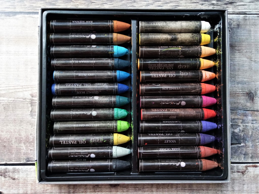

A quick picture of my oil pastels and colour swatch to show how the colours wash out with a damp paintbrush.
I could have gone on and on (and I probably will) but for the sakes of this post not taking a week to read I’ll leave it here.
If you wish to see any of my other illustration work you can do so here.
Listed below are all the oil pastels I have used for these paintings. Included are my trusty watercolour sketch book and my favourite travel water brush (very handy for painting whilst sitting on the sofa!)
These are affiliate links for Amazon UK and Amazon.com (US). This means that, at no extra cost to you, I receive a small percentage if you use my link to buy something. Also, since buying my oil pastels Prima have rebranded them as Art Philosophy.
The UK links are –
Water soluble oil pastels –
Basic set of 12 and Rustic set of 12
Watercolour sketch book and travel water brush
The USA links are –
Basic set of 12 and Rustic set of 12
Watercolour sketch book and travel water brush
How do you shake things up when you are in a creative slump? Any tips for working with water soluble oil pastels?
Thanks for reading
Hannah


Havent tried this yet but love the flowers.
Thank you 🙂 It’s odd to use a medium that is so hard to control but so much fun.